LM recorder
The LM recorder applet is intended for applet developers and can be used to create high-quality promotional videos of applets, without having to use any video editor. Instead code can be written to script execution of LaunchMenu and programmatically. The scripting system contains utils for simple LaunchMenu controlling by means of key events, key visualization, audio insertion, and title and comment creation.
Features
Video recording
The recorder will try to find any valid recording script in the configured scripts directory on disk. You can check the API section to find out what a valid script looks like.
The item representing a script will start running the script on item execution. Any UI provided by the recording applet will be hidden during recording.
File watching
A given script can be actively 'watched' using the Watch record script action. This will make the script automatically rerun when file changes are detected. When the file is altered again before the previous recording has finished, the previous recording will be cancelled.
This is primarily useful when you're writing and tweaking your script, in order to instantly see the updated version run.
When you no longer want to watch the script, a Exit watched script action will be available in any context menu to stop watching.
Audio recording
To ease the recording process, a dedicated audio recorder is included in this applet. This recorder can be used to create voice overs to be used within your video. These voice overs are intended to be short single sentence clips, such that you can later time them with the video using code.
The recording procedure consists of 3 steps:
- Record your audio
- Review your audio, and possibly return to step 1
- Save your audio
The audio is saved to the configured audio directory.
Settings
The LM recorder only contains a couple of settings: directories to saves files to/read files from and a shortcut for exiting record mode.
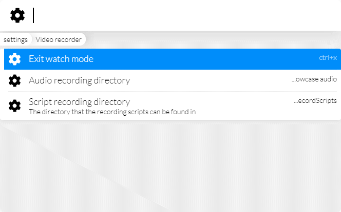
Scripts directory
The scripts directory should point at a directory on disk that contains valid JavaScript (not TypeScript) files that include video scripts. Any file in the directory may contain 0 or more video scripts.
You can check the API section to find out what a valid script looks like.
Audio directory
The audio directory will be used to save audio recordings to. This directory can then later be referenced by your video scripts in order to add audio to videos.
API
Any video script should be defined using the declareVideoScript function exported from the recorder applet (@launchmenu/applet-lm-recorder). Any other later mentioned tools can also be imported from the applet itself.
It's important that non of your applet code references your recording, since your recording will make use of the @launchmenu/applet-lm-recorder dev-dependency which may not exist in the user's runtime installation.
The video script itself will simply be an asynchronous function that uses the provided tools to record and save a video. Below is a minimalistic example:
import React from "react";
import {declareVideoScript, TitleScreen} from "@launchmenu/applet-lm-recorder";

export default declareVideoScript(
    async ({controller, recorder, visualizer, keyVisualizer, LM}) => {
        await controller.resetLM();
        const recordings = `${__dirname}/../../recordings`;
        const recording = await recorder.recordLM(`${recordings}/demo.webm`);

        await visualizer.show(<TitleScreen title="My applet" />, {
            duration: 4000,
        });
        await controller.wait(500);

        await controller.type("oranges");
        await controller.wait(500);

        await recording.stop();
    }
);
The script will receive one argument, including 5 properties. LM is the LaunchMenu instance that the script is running in, and the other 4 properties are described in sections below.
Controller
The controller is used to control LaunchMenu, and provides some functionality to ease automation of LaunchMenu and create nice sequencing in your video.
resetLM
The controller.resetLM function can be used to reset the state of LM. This will clear any searches, close additional sessions and reset the window size.
It's recommended to call this at the start of any recording, in addition to manually resetting any settings or other data tha may impact the recording.
press
The controller.press function can be used to emit key events to LaunchMenu. It accepts a key event, list of keys, or list of key names. If key or key names are provided, both a key press and key release event will be emitted. If purely a key event is provided, just that event will be emitted.
When multiple keys or key names are provided, the last key will be used as the event source, while the rest will be used as additionally held keys. This means that no proper events are emitted for these extra held keys, for that controller.hold can be used instead.
Below is the exact interface of the function, as well as an example:
View code
type press = {
    /**
     * Presses the given keyboard shortcut for a given amount of time in LM
     * @param keys The key combination to be pressed
     * @param config Additional optional configuration
     */
    (
        keys: IKeyInput,
        config?: {
            /** The duration to hold the key for (not applicable if KeyEvent instance was supplied) */
            duration?: number;
        }
    ): Promise<void>;
};

type IKeyInput = KeyEvent | IKeyName | IKeyName[] | IKey[];await controller.press("enter");type
The controller.type function builds on top of controller.press function and can be used to type a sequence of characters. You can feed it a single string, to type said string out as text, or provide an array of more complex key inputs. Below is the exact interface of the function:
View code
type type = {
    /**
     * Types the given text in LM sequentially
     * @param sequence The text to be typed
     * @param config Additional optional configuration
     */
    (
        sequence:
            | string
            | (
                  | string
                  | {
                        /** A key combination to execute */
                        key?: IKeyInput;
                        /** Text to be typed */
                        text?: string;
                        /** Additional delay before this event */
                        delay?: number;
                        /** The number of times to repeat this */
                        repeat?: number;
                        /** The delay in between repeats */
                        repeatDelay?: number;
                    }
              )[],
        config?: {
            /** The base delay between key presses */
            delay?: number;
            /** The additional type delay variation */
            variation?: number;
        }
    ): Promise<void>;
};

type IKeyInput = KeyEvent | IKeyName | IKeyName[] | IKey[];
Below is a more advanced usage example:
await controller.type([
    {key: "enter"},
    {delay: 500, key: ["ctrl", "a"]},
    {delay: 500, text: "150"},
    {delay: 500, key: "enter"},
    {delay: 1500, key: "up", repeat: 6, repeatDelay: 200},
    {delay: 1000, key: "down", repeat: 6, repeatDelay: 200},
]);
hold
The controller.hold function can be used to press a number of keys in sequence, perform some actions while the keys are held down, and then release the keys in reverse sequence. This can for instance be used to press keys including modifiers, in a manor that's more realistic than what controller.press offers.
Below is the exact interface of the function, as well as an example:
View code
type hold = {
    /**
     * Presses the given keys in sequence, and possibly performs another sequence while these keys are held
     * @param keys The keys to be pressed
     * @param config Additional configuration
     */
    (
        keys: IKeyName[] | IKey[],
        config?: {
            /** The callback to perform while the keys are held */
            whileHeld?: () => Promise<void>;
            /** The delay between two consecutive key presses */
            keyDelay?: number;
        }
    ): Promise<void>;
};await controller.hold(["ctrl", "a"], {
whileHeld: async ()=>{
...
}
});selectItem
The controller.selectItem function can be used to select an item from the menu. This function can be provided with a regex pattern that the item must match, or a function that determines whether a given item is the item you're after, and takes care of cursor navigation for you.
The function assumes that the item will always be found at some point, or will otherwise never resolve.
Below is the exact interface of the function, as well as an example:
View code
type selectItem = {
    /**
     * Selects a given item in the menu by navigating to it with the keyboard
     * @param itemMatch The name pattern of the item to select, or a callback to check if this is the item to look for
     * @param config The config for how to navigate to items
     * @returns A promise that resolves once the item was selected
     */
    selectItem(
        itemMatch: IItemMatch,
        config?: IItemNavigationConfig
    ): Promise<void>;
};

type IItemMatch = RegExp | ((item: IMenuItem, hook: IDataHook) => boolean);
type IItemNavigationConfig = {
    /** The base delay between key presses */
    delay?: number;
    /** The additional type delay variation */
    variation?: number;
    /** The name of the key to move the cursor down */
    downKey?: IKeyInput;
    /** The name of the key to move the cursor up */
    upKey?: IKeyInput;
};await controller.selectItem(/settings/i);navigate
The controller.navigate function builds on top of the controller.selectItem function in order to make nested menu navigation a bit easier. You can give it a sequence of item matchers, and it will automatically find and execute each item in order.
Below is the exact interface of the function, as well as an example:
View code
type navigate = {
    /**
     * Navigates through several menu layers at once, executing the item the matching items
     * @param itemMatches The matchers for the items to find and execute
     * @param config Additional configuration for selecting the items
     */
    navigate(
        itemMatches: IItemMatch[],
        config?: {
            /** The additional type delay variation */
            variation?: number;
            /** The name of the key to move the cursor down */
            downKey?: IKeyInput;
            /** The name of the key to move the cursor up */
            upKey?: IKeyInput;
            /** The name of the key to execute the item */
            executeKey?: IKeyInput;
            /** The delay before executing an item */
            executeDelay?: number;
            /** The delay before selecting the item */
            selectDelay?: number;
            /** The base delay between key presses */
            keyDelay?: number;
        }
    ): Promise<void>;
};

type IItemMatch = RegExp | ((item: IMenuItem, hook: IDataHook) => boolean);await controller.navigate([/settings manager/i, /base settings/i, /menu/i]);waitOpen
The controller.waitOpen function will return a promise that only resolves once LaunchMenu has been opened. Additionally the value false can be passed an argument to wait for LM to close. This can be used to pause script execution and perform some manual tasks in the video, and continue the script once LaunchMenu was opened by the user.
wait
The controller.wait function will return a promise that resolves after the given amount of milliseconds. This can be used to easily pace your video.
Recorder
The recorder class can be used to create recordings of a monitor, LaunchMenu, or any other window. It can also be used to take screenshots.
Record
The recorder.recordLM, recorder.recordScreen, and recorder.recordWindow functions can be used to obtain a Recording instance. Each function takes a file path to save the recording to (should have the .webm extension) and optionally a record configuration.
This configuration always accepts the following properties:
/** Some recording configs */
export type IRecordingConfig = {
    /** A section to crop to in the final render */
    crop?: IRect;
    /** The bitrate to output the final render at */
    bitRate?: number;
    /** Represents the amount of data loss 0-51 integers (0 =lossless), see ffmpeg -crf */
    crf?: number;
};
Below is a simple usage example:
const recordings = `${__dirname}/../../recordings`;
const recording = await recorder.recordLM(`${recordings}/demo.webm`);
Screenshot
The recorder.screenshotLM, recorder.screenshotScreen, and recorder.screenshotWindow functions can be used to save a screenshot to a specified path. This path should have the .png extension. You can also optionally provide a screenshot configuration.
This configuration always accepts the following properties:
/** Some screenshot configs */
export type IScreenshotConfig = {
    /** A section to crop to in the final picture */
    crop?: IRect;
};
Below is a simple usage example:
const recordings = `${__dirname}/../../recordings`;
await recorder.screenshotLM(`${recordings}/screenshot.png`);
Recording
The recording class can be used to pause, resume and stop a recording. Additionally cancel can be used to cancel the recording. stop will stop the recording and save it to disk. pause and resume can be used for making virtual jump cuts by not recording a given part of the script.
addAudio
The recording.addAudio function can be used to add an audio fragment to a recording. It simply adds the audio fragment at the given path to the recording at the point in time this function was called at.
It has the following interface:
type addAudio = {
    /**
     * Adds the given audio segment at this point in time of the recording
     * @param path The path to the audio file
     * @param config The configuration of the audio
     */
    (path: string, config?: IAudioConfig): void;
};

type IAudioConfig = {
    /** The volume of the audio clip */
    volume?: number;
    /** Number of milliseconds time offset to add the audio at */
    offset?: number;
};
timestamps
In some cases it's useful to be able to make an table of contents for your video, with timestamps to different sections. For this purpose timestamps can be stored programmatically, and exported to a json file.
The recording.tagTime function takes a path as an argument, which can have .s (dots) in it to represent nested paths. Calling this will tag the current time in the recording with the given object path.
After the recording finished, you can call recording.saveTimestamps to store the timestamps to a json file. This function optionally takes a file path as an argument, which should finish with the .json extension. If no path is provided, the path of the video recording will be used, with timestamps append to the end.
Below is an example of some simple usage:
await controller.wait(500);

recording.tagTime("title.start");
await visualizer.show(<TitleScreen title="My applet" />, {
    duration: 4000,
});
recording.tagTime("title.end");

recording.saveTimestamps("timestamps");{
"title": {
"start": 0.5,
"end": 4.5
}
}Visualizer
The visualizer can be used to add extra overlay elements on top of LaunchMenu. This can be used add comments, point at stuff, or add full title screens.
The visualizer.show function can be used to show a given element. It takes two arguments, the element to show and optionally an extra configuration:
View code
type show = {
    /**
     * Shows a given remote element in the overlay screen (only if screen overlay is enabled)
     * @param path The absolute path to the component to be displayed
     * @param config Additional configuration
     * @returns Functions to control to element
     */
    (element: JSX.Element, config: IShowConfig): Promise<{
        /** Disposes the element */
        destroy: () => void;
    }>;
};
type IShowConfig = {
    /** The duration to show the screen for */
    duration?: number;
    /** Whether to fade in, and optionally the duration */
    fadeIn?: number | boolean;
    /** Whether to fade out, and optionally the duration */
    fadeOut?: number | boolean;
};
If a duration is passed, the element will be removed after said delay automatically. If no duration is passed the return destroy function can be used to dispose the element.
Below is an example of using the show function:
await visualizer.show(<div>Hello</div>, {
    duration: 4000,
});
Additionally a visualizer.showControllable function exists to ease element/component alterations over time. This allows you to pass a component instead of an element, and use the update function to easily change its props over time:
View code
type showControllable = {
    /**
     * Shows the given component with the initial props, and allows for simple prop updates afterwards
     * @param Comp The component to be shown and controlled
     * @param config Additional configuration
     * @returns Functions to control to element
     */
    <T extends Record<string, any>>(
        Comp: FC<T>,
        {props: initialProps, ...config}: IShowConfig & {props: T}
    ): Promise<{
        /** Disposes the element */
        destroy: () => void;
        /** Updates the element's props */
        update: (props: Partial<T>) => void;
    }>;
};
type IShowConfig = {
    /** The duration to show the screen for */
    duration?: number;
    /** Whether to fade in, and optionally the duration */
    fadeIn?: number | boolean;
    /** Whether to fade out, and optionally the duration */
    fadeOut?: number | boolean;
};
Below is an example of using the showControllable function:
const myText = await visualizer.show<{text: string}>(
    ({text}) => <div>{text}</div>,
    {props: {text: "Hello"}}
);
await controller.wait(1500);
myText.update("How are you?");
await controller.wait(1500);
myText.update("Bye?");
await controller.wait(1500);
myText.destroy();
Components
A number of standard components have been provided that can be shown. These can be used to make the styling in your video consistent with other videos, but any custom components may also be used.
Title screen
The title screen can be used to add a simple title, description/subtitle, or list of covered points. Below is an example using all 3 options:
await visualizer.show(
    <TitleScreen
        title="Video applet"
        description="Watch videos now"
        list={["Find online videos", "Watch videos"]}
    />,
    {
        duration: 4000,
    }
);
Note screen
The note screen can be used to add an important note on the screen, unrelated to the specific contents currently visible in the screen.
await visualizer.show(<NoteScreen>Usable for any video type</NoteScreen>, {
    duration: 4000,
});
Overlay
The overlay component can be used to create semi-transparent overlays that can float in an unused area of the screen. It can be used to add additional information to things visible in the screen.
await visualizer.show(
    <Overlay css={{top: 20, left: 20}}>Use the video pattern</Overlay>,
    {
        duration: 4000,
    }
);
Pointer overlay
The pointer overlay serves the same purpose as the Overlay but also contains an arrow that can point at a specific section.
await visualizer.show(
    <PointerOverlay pointAt={{x: 40, y: 150, direction: "left"}}>
        Video preview
    </PointerOverlay>,
    {
        duration: 4000,
    }
);
HighlightRect
The highlight rect(angle) can be used to highlight a section of the screen, and possibly also add a comment to it (internally using the pointer overlay). You can either specify a rectangle yourself, or use the name of a section of LaunchMenu. This component isn't aware what sections of LM are currently visible, so you may also need to specify a list of visible sections for the correct area to be highlighted.
await visualizer.show(
    <HighlightRect
        area="path"
        visible={["path", "textField", "content", "menu"]}
        comment="See the video name in the path"
    />,
    {
        duration: 4000,
    }
);
Additionally the showHighlightRect function (which makes use of the HighlightRect component) can be used to animate smooth open and close transitions:
const rect = await showHighlightRect(visualizer, {
    area: "content",
    comment: "Read the result in the content section",
});
await controller.wait(2000);
rect.update({area: "menu", comment: "stuff"});
await controller.wait(2000);
rect.destroy();
Fullscreen
The visualizer also supports data to be shown in the entire monitor. To achieve this, a new non-interactive transparent window is opened. This behavior will have to be enabled manually by calling visualizer.setScreenOverlayEnabled(true).
Using this overlay system is a little more cumbersome than the normal visualization, because we have to communicate with this window using IPC, thus not allowing us to directly exchange components and other non-json objects.
Several configuration methods are provided:
setScreenOverlayRect(rect: IRect): Allows you to specify the rectangle that the window should occupy (defaults to a FHD main display)setScreenOverlayThemePath(path: string): Specifies the file path to the LM theme to be used in this window (used by Box components)setCursorVisible(visible: boolean): Specifies whether the user's mouse should currently be visible. Note that to make the cursor invisible, the overlay is made interactive, and the mouse can thus no longer be used.setScreenOverlayState(state: T): Allows for updating of component state in the overlay screen. This state is forwarded to all shown components in the window.
To show a custom element, the visualizer.showScreen function can be used. It has the following interface:
View code
type showScreen = {
    /**
     * Shows a given remote element in the overlay screen (only if screen overlay is enabled)
     * @param path The absolute path to the component to be displayed
     * @param config Additional configuration
     * @returns Functions to control to element
     */
    <T extends Record<string, IJSON>>(
        path: string,
        config: IShowScreenConfig<T>
    ): Promise<{
        /** Disposes the element */
        destroy: () => void;
        /** Updates the element's props */
        update: (props: T) => void;
    }>;
};
type IShowScreenConfig<T> = {
    /** The props to pass to the element */
    props?: T;
    /** The duration for which to show this element */
    duration?: number;
    /** Whether to fade in, and optionally the duration */
    fadeIn?: number | boolean;
    /** Whether to fade out, and optionally the duration */
    fadeOut?: number | boolean;
    /** Whether to hide the cursor while this element is visible */
    hideCursor?: boolean;
};
Below is an example of how to use this:
export const MyComp: FC<{name: string}> = ({name}) => <div>{name}</div>;const myComp = await visualizer.showScreen("myPath/myComponent>MyComp", {
props: {name: "hoi"},
});
await controller.wait(2000);
myComp.update({name: "Bye"});
await controller.wait(2000);
myComp.destroy();Notice that to specify the property to access at a path >[property] can be used at the end of the path. If this is absent, the default export will be used instead.
Most of the before mentioned standard components also have a dedicated remote controller to ease remote usage:
await showRemoteTitleScreen(visualizer, {
    props: {name: "My video applet"},
    duration: 4000,
    hideCursor: true,
});
Key visualizer
The key visualizer can be used to visualize the user's key presses. It's enabled by default, but can manually be disabled by calling visualizer.setListenerEnabled(false).
It has a couple more method that could be useful, but generally don't have to be used:
showKeyText: Used to show fake key presses that didn't actually occur in the programsetListenerOptions: Used to fine-tune key visualization configurationsetVisualizationComponent: Used to specify a custom component for key press visualizationssetFullScreenMode(enabled: boolean): Used to show the key visualization in the entire screen, instead of in LM. Requires the visualizer's fullscreen mode to be enabledsetScreenVisualizationComponentPath: Used to specify a custom visualization component to be used in full screen mode. Receives the same props as a component set withsetVisualizationComponentwould receive
Roadmap
No major new features are planned as of yet, but any suggestions are welcome.